Semantic HTML · Green UX
By Séverine Baudrand.
The Lynx Audit: Why HTML is the Soul of UX
Modern Front-End has a dependency problem. In 2026, we build websites like we’re directing Hollywood movies: heavy JS frameworks, auto-playing videos, and "pixel-perfect" assets. We’ve traded resilience for glitter.
But what happens when you strip it all away?
To find out, I decided to take a radical step backward. I ditched Chrome for a day and browsed the web through Lynx, a text-only browser from 1992.
In a world of "JS-heavy" everything, going back to the terminal isn’t nostalgia. It’s a brutal, honest audit of your site’s soul. If your brand disappears when the images stop loading, you haven't built a website: you’ve built a fragile digital poster.
Index of Essential Notions
- Lynx
- A terminal-based browser that ignores CSS, JavaScript, and images. It renders pure HTML structure. Nothing else. Lynx is the closest thing we have to a truth serum for document hierarchy.
- w3m
- A more "modern" (forgiving) terminal browser. It supports tables and limited images. Ideal for a transitional audit when you want structure first, layout second.
- Text-Only Browsing
- Navigating without a Graphical User Interface (GUI), either by constraint (bandwidth or hardware) or by choice (data saving, focus, energy efficiency).
- Semantic Integrity
- The ability of a document to convey meaning through structure alone: headings, landmarks, link context, and reading order: without relying on styling or scripts.
- The "Hydration" Tax
- The hidden cost of parsing and executing JavaScript to make a page interactive, paid in CPU time, battery life, data usage, and carbon emissions.
- Resilient UX
- Design that remains usable when conditions degrade: slow networks, disabled images, blocked JavaScript, legacy hardware, or assistive technologies.
- HTML Reachability
- The proportion of meaningful content and navigation accessible without executing JavaScript.
- Content-First Rendering
- An approach where content is delivered and readable before any enhancement layer is applied.
Quick Tutorial: Audit your own site
Want to see what your code actually looks like without the makeup? Here is how to run your own audit in 60 seconds.
Using Lynx (The Purist Way)
Install: brew install lynx (Mac) or sudo apt install lynx (Linux).
Launch: lynx https://your-site.com
Navigation: Use your arrow keys. Up/Down to select links, Right to follow, Left to go back. Press q to exit.
Using w3m (The Balanced Way)
Install: brew install w3m or sudo apt install w3m.
Launch: w3m https://your-site.com
Navigation: Use your mouse or arrows. Press q to exit.
If your site is unreadable here, don’t debug Lynx. Debug your HTML.
The Contrast: A Content-First Site vs. The "Immersive" Giant
To test my theory, I compared a site I had built with a "Modern Immersive Experience" (you know the ones: scroll-jacking, WebGL, and 50MB of initial payload).
The "Immersive" Site in Lynx
It was a digital graveyard.
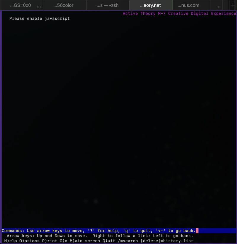
Observed in Lynx:
- No headings
- No navigable links
- No readable content
- Just a single sentence: [This site requires JavaScript to be enabled]
Verdict: If JavaScript fails or is unavailable, your "immersive" brand can disappear. Screen reader behaviour must be tested separately: Lynx is not a screen reader. You’ve built a wall, not a web page.
My Site in Lynx
It felt like reading a clean, well-organized technical manual.
Observed in Lynx:
- All headings exposed in logical order
- Navigation links immediately accessible
- Core content readable without scrolling through scripts or placeholders
Verdict: The content is the star. The CSS was just the supporting actor.
The Translation Table
This translation table decodes what modern front-end language becomes once all visuals, motion, and scripts are removed. Lynx doesn’t interpret intent or branding. It only shows what is actually there.
| Modern Front-End Gloss | The Lynx Reality |
|---|---|
| "Immersive Storytelling" | Long blocks of slogans before any meaningful action or information appears |
| "Interactive UI Component" | A non-functional [ ] bracket. |
| "Pixel-Perfect Precision" | File not found. |
| "Digital Sobriety" | Finally, a site that loads before my coffee gets cold. |
| “Scroll-driven narrative” | Endless links with no hierarchy |
| “Motion-led design” | Nothing happens |
| “Brand experience” | Plain text (if you’re lucky) |
The "Invisible" User: Browsing without the bandwidth
Using Lynx may look niche or nerdy.
But in 2026, a growing tribe of people use standard browsers (like Chrome or Safari) with images and videos disabled. Sometimes to save data, sometimes to preserve battery life, sometimes to reduce their carbon footprint.
It also includes users on low-end devices, unstable networks, corporate environments with restricted scripts, or reader-mode enthusiasts.
The browsing experience suddenly looks a lot like a text-only browser. Visual storytelling vanishes. Motion disappears. What remains is structure, content, and meaning.
Lynx is not the target audience. It is the diagnostic tool I chose to demonstrate why websites must still work when visuals are optional and resources are constrained.
Post-Audit: My "Lynx-Fix" To-Do List
Even if my site passed the test, the terminal is a harsh judge. Here is my personal backlog to reach Text-Only Excellence:
Implement Skip-Links: I need to add a "Skip to Content" link at the very top. Honestly, as someone claiming to be an accessibility expert, forgetting skip-links is a total disgrace. Scrolling through the entire navigation menu every single time is a UX crime in a terminal, and I’m my own first victim.
Remove an undocumented analytics cookie : During the audit, I discovered an analytics cookie installed without my knowledge. The site had no consent banner, so this unexpected tracking needed investigation. We chose to remove the cookie entirely and return to the original minimal approach.
Audit the "Ghost Images": Some icons were missing aria-hidden="true" or proper alt-text, leaving weird [IMG] placeholders.
Refactor "Div-Buttons": I found interactive elements not using native <button> tags. Lynx ignored them. They are going back to standard HTML.
Descriptive Link Text: Changing "Read more" to descriptive titles. In a list of links, "Read more" is a riddle, not a guide.
The A11y Connection: Sobriety is Accessibility
Looking at my To-Do list, I realized something fundamental: these are not "Lynx-specific" bugs. They are basic accessibility failures.
Digital sobriety and accessibility share useful foundations: semantic HTML, clear navigation and fewer unnecessary dependencies. A text-browser audit can reveal structural problems, but it does not establish WCAG or legal compliance. Screen readers, keyboard interaction and the visual interface still need their own tests. Accessibility is not a legal constraint to add at the end: it is the foundation of a resilient, low-carbon web.
The Green UX & A11y Checklist
Optimizing for a text-only environment isn't about supporting legacy tech; it's about radical efficiency. When you align your site with these standards, you are implementing a high-performance Green UX strategy.
The Structural Bones
Semantics First: Use native HTML5 landmarks (<main>, <nav>, <section>). It is the only map a terminal (or a screen reader) has to navigate your world.
Provide a Way to Skip Repeated Navigation: Don't make your users "pay" in scrolls to reach your content. Honestly, forgetting this is a total disgrace for any accessibility expert. I’m my own first victim.
Button vs. Link Discipline: If it triggers an action, use <button>. If it goes somewhere, use <a>. Avoid "Div-soup" at all costs: Lynx (and the planet) will thank you.
The Clarity Layer
The Alt-Text Audit: Decorative <img> elements get alt="". Decorative icons can use aria-hidden="true" when appropriate. Informative images get meaningful descriptions. No "Ghost Images" allowed.
Contextual Labels: Avoid generic "Click here" or "Read more". Links must make sense out of context (e.g., "Read the Performance Audit").
Zero-JS Fallback: Ensure your core content and primary navigation are reachable even if your scripts fail to hydrate. Resilience is the ultimate Green UX metric.
The Lean Philosophy
Avoid "Scroll-Jacking": If your content only makes sense through a specific scroll-triggered animation, it’s not a website; it’s a hostage situation. Let users control their own pace.
Kill the Sliders: Most carousels are accessibility nightmares. If a message is important, give it a headline. If it is not, remove it.
Prioritize Copy over Heavy Assets: High-resolution videos often hide weak messaging. A well-written sentence is lighter, searchable, and works on every device ever made. Before adding a 5MB asset, ask yourself: "Can a better sentence do the same job?"
The Bottom Line: High-performance Front-End isn't about how much you can add, but how little you can depend on.
Conclusion: Pixels are optional, Meaning is not
Browsing in a terminal reminds us that Front-End Performance is not just about speed: it is about reach. When you optimize for the lowest common denominator (the text) you build a stronger foundation for a robust, searchable and accessible site.
My Mantra: If it’s solid in a terminal, it will be sublime on an 8K screen. The inverse is not true.